A color drenching bedroom is one of the most powerful – and most underused – solutions for making a small space feel dramatically larger. Yet most people have never tried it.
You have rearranged the furniture three times. You have tried mirrors, minimalist decor, and more throw pillows than you will ever need. Your small bedroom still feels small.
Here is what most design blogs miss: the problem is not the size of the room. It is the visual noise created by too many competing colors and surfaces.
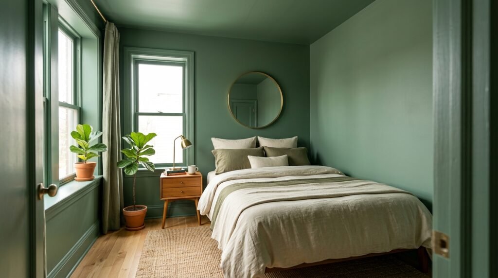
The color drenching bedroom technique fixes this at the root. Instead of painting just the walls, you coat everything – walls, ceiling, trim, and even furniture – in the same hue or tonal family. The result is a room that feels seamless, cohesive, and paradoxically much larger than it actually is.
This guide walks you through exactly how to execute a color drenching bedroom transformation from start to finish. Whether you rent a studio apartment or simply work with limited square footage, you will leave with a clear, actionable plan and a bedroom that finally feels like it breathes.
What Is Color Drenching? (And Why It Works for Small Bedrooms)
Defining Color Drenching
Color drenching is the practice of applying a single color – or a monochromatic tonal range – to every surface in a room. Walls, ceilings, trims, baseboards, window frames, built-ins, and sometimes even furniture and soft furnishings. All of it.
It is the opposite of the accent wall. Rather than using color to create contrast and division, color drenching uses it to blur boundaries and dissolve the hard edges of a room. The technique surged into mainstream popularity around 2020 as small-space urban living became the new normal.
The Psychology Behind Why It Makes Rooms Feel Larger
When a room has many different colors – white ceiling, beige walls, brown trim, dark furniture – your eye jumps constantly between contrasting surfaces. This visual fragmentation causes the brain to register each element as a separate boundary, making the room feel more enclosed.
A color drenching bedroom removes those interruptions. When the ceiling, walls, and trim share the same hue, the room reads as one continuous, unbroken space. The eye travels further without stopping. There are no hard edges – and your brain interprets that as more space.
As color consultant Annie Sloan has noted, the more visual boundaries you create with contrasting color, the smaller a room appears. Remove those boundaries, and the space opens up.
How to Choose the Right Color for a Color Drenching Bedroom
This is the decision most people agonize over – and understandably so. The color you choose will cover every surface in the room, so it needs to be right. Here is how to think about it.
Light Colors vs. Dark Colors: Debunking the Myth
Conventional wisdom says small rooms need white or pale colors to feel larger. A color drenching bedroom challenges that assumption entirely.
Yes, pale shades – warm cream, sage green, dusty blue, soft greige – work beautifully. They are forgiving, easy to live with, and reflect natural light well.
But here is the surprise: deep, saturated colors – forest green, navy blue, charcoal, even near-black – can also make a small room feel larger when applied as a full color drench. Dark colors absorb light and visually recede, meaning the walls appear to dissolve. The room feels like it extends into shadow rather than stopping at a hard painted surface.
The key is not the lightness or darkness of the color. It is the consistency of applying it everywhere.
Undertones Matter More Than You Think
A warm color drench feels cozy and enveloping. A cool one feels crisp and airy. Before committing, identify the undertones in your chosen color.
- Warm undertones (red, yellow, orange): Best for north-facing rooms that receive little natural light. They compensate for cool, flat daylight.
- Cool undertones (blue, green, gray): Best for south- or east-facing rooms. They balance bright, warm natural light beautifully.
Best Color Choices for a Color Drenching Bedroom
Here are some of the most designer-approved picks:
- Farrow & Ball Mizzle (No. 266) – A sophisticated green-gray. Versatile in both light and dark rooms.
- Benjamin Moore Hale Navy (HC-154) – A classic deep navy that creates a moody, expansive drench.
- Sherwin-Williams Dustblu (SW 6248) – A powdery blue that feels serene without going cold.
- Little Greene Porphyry Pink – A terracotta-adjacent blush that feels grounded when fully drenched.
- Farrow & Ball Railings (No. 31) – A near-black navy that is dramatic and surprisingly warm in small spaces.
Step-by-Step: How to Color Drench Your Bedroom
Step 1: Prep Your Space
Clear the room as much as possible. Patch holes, sand rough patches, and wipe down all surfaces. Any imperfection gets amplified when every surface shares the same color.
Dust and grease prevent paint from adhering properly, leading to peeling and an uneven finish. If you have glossy painted surfaces on trim or baseboards, sand lightly with 220-grit paper so the new paint has something to grip.
Step 2: Choose Your Finish Strategy
This is where most DIYers go wrong. Color drenching does not mean using the same paint product on every surface. Different surfaces need different finishes.
- Walls: Matte or eggshell. Matte absorbs light and hides imperfections. Eggshell is slightly more durable and easier to clean.
- Ceiling: Flat/matte finish in your chosen color. Flat finishes minimize visible texture on ceilings.
- Trim, baseboards, window frames: Satin or semi-gloss in the same color. The slight sheen difference adds subtle depth without breaking the drench.
- Painted furniture: Satin or semi-gloss for durability.
Using slightly different finishes within the same color is the pro move that separates a flat-looking drench from a rich, layered one.
Step 3: Paint in the Right Order
Always start at the ceiling. Paint drips down, not up.
- Ceiling – two coats, with full drying time between coats
- Walls – two coats
- Trim, baseboards, and window frames – two coats
- Doors – two coats, including the door edges
Use a quality angled brush for trim work and a roller with the appropriate nap: 3/8″ for smooth walls, 1/2″ for textured surfaces.
Step 4: Handle the Ceiling-to-Wall Transition
The ceiling-to-wall transition is the trickiest part of a color drenching bedroom. You have two approaches:
- Option A – Let them blend: Cut in freehand without taping the ceiling line. The slight visual merging of wall and ceiling color actually enhances the drenching effect.
- Option B – Cut clean: Use painter’s tape for precision. Because the colors match, small imperfections will not register anyway.
Step 5: Layer In Textural Contrast
Once painting is complete, the room becomes a tonal canvas. Now you layer in texture to add depth and prevent the space from feeling flat. In a color drenching bedroom, texture does the work that contrast would normally do.
- Linen or cotton bedding in a slightly lighter or darker tone of the same color
- A woven or bouclé throw in a neutral within the same hue family
- Wooden furniture that brings warmth without introducing a competing color
- Metallic accents – brass, copper, matte black – in small doses for visual interest
Furniture and Decor in a Color Drenched Bedroom
To Match or Not to Match?
You do not need to paint all your furniture the same color. The goal is tonal harmony, not uniformity.
Natural wood, rattan, and stone tend to complement rather than compete with a color drench – they read as textures, not colors. A mid-tone oak bedframe in a forest-green drenched room feels grounded and organic. If you want to paint furniture, use the same color family: one shade deeper for a grounding effect, or one shade lighter for an airier look.
Soft Furnishings
Stick to the same tonal family. If your drench is blue-green, layer in seafoam, sage, and white-linen tones in your bedding and curtains. Introduce one or two neutrals – warm white, natural linen, oatmeal – to prevent the room from feeling oversaturated.
Avoid introducing a strongly contrasting color as a “pop.” It immediately breaks the enveloping quality of the drench and makes the room feel smaller again.
Lighting: The Variable Nobody Talks About
Lighting is especially critical in a color drenching bedroom. Your chosen color reads very differently under different bulb temperatures, measured in Kelvin (K).
- Warm white bulbs (2700K–3000K): Enhance yellow and red undertones. A sage green drench can turn olive; a dusty blue can shift greenish.
- Cool white bulbs (4000K+): Enhance blue and gray undertones. A warm blush can look mauve; a terracotta can appear muted.
Always test your paint under your actual lighting – not just in daylight – before committing to the full room.
Color Drenching for Specific Small Bedroom Scenarios
Studio Apartments: Drench the Whole Space
In a studio apartment, consider letting the color drench flow from the sleeping area into the main living space. This blurs the boundary between zones and makes the entire apartment feel larger and more intentional. Use a single color throughout and define zones with furniture placement and lighting rather than color contrasts.
Rooms With Low Ceilings
Low ceilings are where a color drenching bedroom delivers its most dramatic results. By painting the ceiling the same color as the walls, you remove the hard visual line where the room appears to “end.” The ceiling visually lifts. Counterintuitive? Absolutely. Effective? Without question.
Rentals and Temporary Spaces
If you cannot paint, approximate a color drenching bedroom effect with these alternatives:
- Peel-and-stick wallpaper applied to walls and ceiling panels
- Large-scale fabric wall hangings in a single coordinating color
- Deep-toned shelving and furniture that shares a tonal family with your existing walls
- Bedding, curtains, and rugs in a tightly controlled color palette
Key Statistics: Color Psychology in Small Spaces
The case for a color drenching bedroom is not just aesthetic – it is backed by data:
- Research in the Journal of Environmental Psychology found that rooms with monochromatic color schemes were perceived as significantly more spacious than those with contrasting combinations, even when actual square footage was identical.
- The National Association of Realtors reports that bedrooms staged with cohesive, single-tone color schemes photograph larger and sell faster than rooms with multiple competing colors.
- Sherwin-Williams reports that requests for tone-on-tone bedroom color schemes rose by over 40% between 2020 and 2023, driven by the surge in small-space urban living.
- Interior design platform Houzz identified color drenching as one of the top five most-searched bedroom design trends for two consecutive years.
Expert Tips: What Designers Know That Most DIYers Don’t
1. Go One Shade Darker on the Ceiling
Rather than using the exact same paint on the ceiling, choose one shade deeper. This creates intentional depth and makes the ceiling feel considered – not accidental.
2. Don’t Forget the Inside of Closet Doors
Painting the interior of closet doors and shelving the same color extends the drench into every nook. This amplifies the seamless, enveloping effect significantly.
3. Test in a Large Patch, Not a Paint Chip
Paint a test patch of at least 12″ x 12″ on your actual wall. Live with it for 48 hours and observe it under morning light, afternoon light, and artificial light before committing to the full room.
4. The Sheen Difference Is Your Secret Weapon
Matte on walls, satin on trim – same color. This tone-on-tone finish approach is a staple of professional decorators. The variation in sheen adds dimension without introducing contrast.
5. Keep Your Wood Tones Consistent
If you have multiple wood furniture pieces, keep them in the same temperature family – all warm or all cool. Mixed wood tones are the single most common element that breaks the harmony of an otherwise well-executed color drench.
Where to Find Expert Color Advice Near You
Getting a color drenching bedroom right starts with quality paint and knowledgeable guidance – and that often means going beyond the big-box store.
- New York City: Janovic Paint & Decorating (multiple Manhattan locations) carries Farrow & Ball, Benjamin Moore, and Fine Paints of Europe, with professional color consulting available.
- Los Angeles: Crown City Paint in Pasadena has served designers and homeowners doing tone-on-tone work for decades, with staff known for nuanced color-matching expertise.
- Chicago: The Paint Spot in Lincoln Park carries specialty brands and offers color consultation appointments, especially useful for small-space color drenching projects.
- London: Papers and Paints in Chelsea is a specialist supplier trusted by interior designers. They can mix any color to exact specification – invaluable when trim, wall, and ceiling paint need to be precise tonal variations of a single hue.
- Melbourne: Haymes Paint stores offer in-store color consultations designed around small-space solutions, with their Ultra Premium range well-regarded for full-room drenches.
If you are working with a designer, ask specifically whether they have experience with color drenching. Not all decorators do – the technique requires confident, precise color matching across multiple finishes.
FAQ: Color Drenching Bedroom Questions Answered
What is color drenching, and how is it different from painting a room one color?
Color drenching goes further than painting only the walls. A color drenching bedroom means applying the same color – or a tonal variation – to every surface: ceiling, trim, baseboards, and often furniture. Standard single-color painting leaves the ceiling white and the trim contrasting, which creates visual boundaries. A color drenching bedroom removes those boundaries entirely.
Does color drenching work in dark bedrooms with limited natural light?
Yes – and in some cases it works even better in low-light rooms. A light drench reflects available light evenly without the stark contrast of a white ceiling. A deep drench leans into the moodiness of the room and creates an intentional, enveloping atmosphere rather than fighting it.
Can I color drench a bedroom if I’m renting and can’t paint?
You can approximate the effect. Control the color palette of your soft furnishings, bedding, curtains, and rugs within a tight tonal family. Add large fabric wall hangings or damage-free peel-and-stick wallpaper. Choose furniture in coordinating tones. You will not achieve the full seamless result, but you will see meaningful visual improvement.
What colors work best for a color drenching bedroom to make it feel larger?
Both light and dark colors can work. Light shades – warm white, sage green, dusty blue, blush – are most forgiving and reflect natural light. Deep shades – navy, forest green, deep terracotta – create a visually receding effect that also expands the perceived space. The most important factor is not the shade itself. It is the consistency of applying it everywhere.
Does color drenching work in a bathroom too?
Absolutely. A color drenched bathroom – particularly a small en-suite – can feel spa-like and far more spacious than the same room painted white with contrasting grout. Use bathroom-specific paint with mold resistance, and pay close attention to how grout color interacts with your chosen hue.
How much does it cost to color drench a bedroom?
For a standard bedroom (roughly 120–150 sq ft with 8-ft ceilings), plan for 2–3 gallons of paint for walls and ceiling, plus 1 quart for trim. Budget paint runs $20–$30 per gallon; premium brands like Farrow & Ball or Benjamin Moore Aura run $60–$120 per gallon. Total material cost typically falls between $80 and $400 depending on brand and room size. Add $300–$800 in labor if hiring a painter.
Should the color drench extend to the floor?
Not typically. Hardwood, tile, and carpet provide natural grounding. However, in a painted concrete floor situation or a micro apartment, extending the drench to the floor can be extraordinarily effective.
Conclusion: Your Color Drenching Bedroom Action Plan
A color drenching bedroom is one of the most transformative, cost-effective upgrades you can make to a small space. It does not require a renovation, new furniture, or a designer. It requires a decision, a few gallons of quality paint, and the willingness to commit fully to a single color.
The research supports it. Designers advocate for it. And small-apartment dwellers who have tried it consistently report the same outcome: a bedroom that finally feels like a room, not a closet with a bed in it.
Your action plan:
- Identify the natural light conditions in your bedroom (north-facing, south-facing, etc.)
- Select 2–3 potential colors and order large paint sample jars
- Test each color on a 12″ x 12″ patch on both your wall and your ceiling
- Live with your test patches for 48 hours across different lighting conditions
- Commit to your color, plan your finish strategy, and paint from the top down
You do not need more square footage. You need a better color strategy. Go drench something.